SaaS dashboards have a specific shape. A header with the workspace switcher and notifications. A sidebar of navigation. A main area that's a grid of widgets — some lightweight (a counter, a status pill), some heavy (a chart, a table of last 1,000 events), some live (a queue depth that updates every few seconds). Multi-tenant. Permissions everywhere. Some users with three rows of data, some with three million.
This article is about the architectural choices that hold up across all of that, after a year of feature requests have piled up. None of it is exotic — but the combination is what separates a dashboard that gets faster as it grows from one that gets slower.
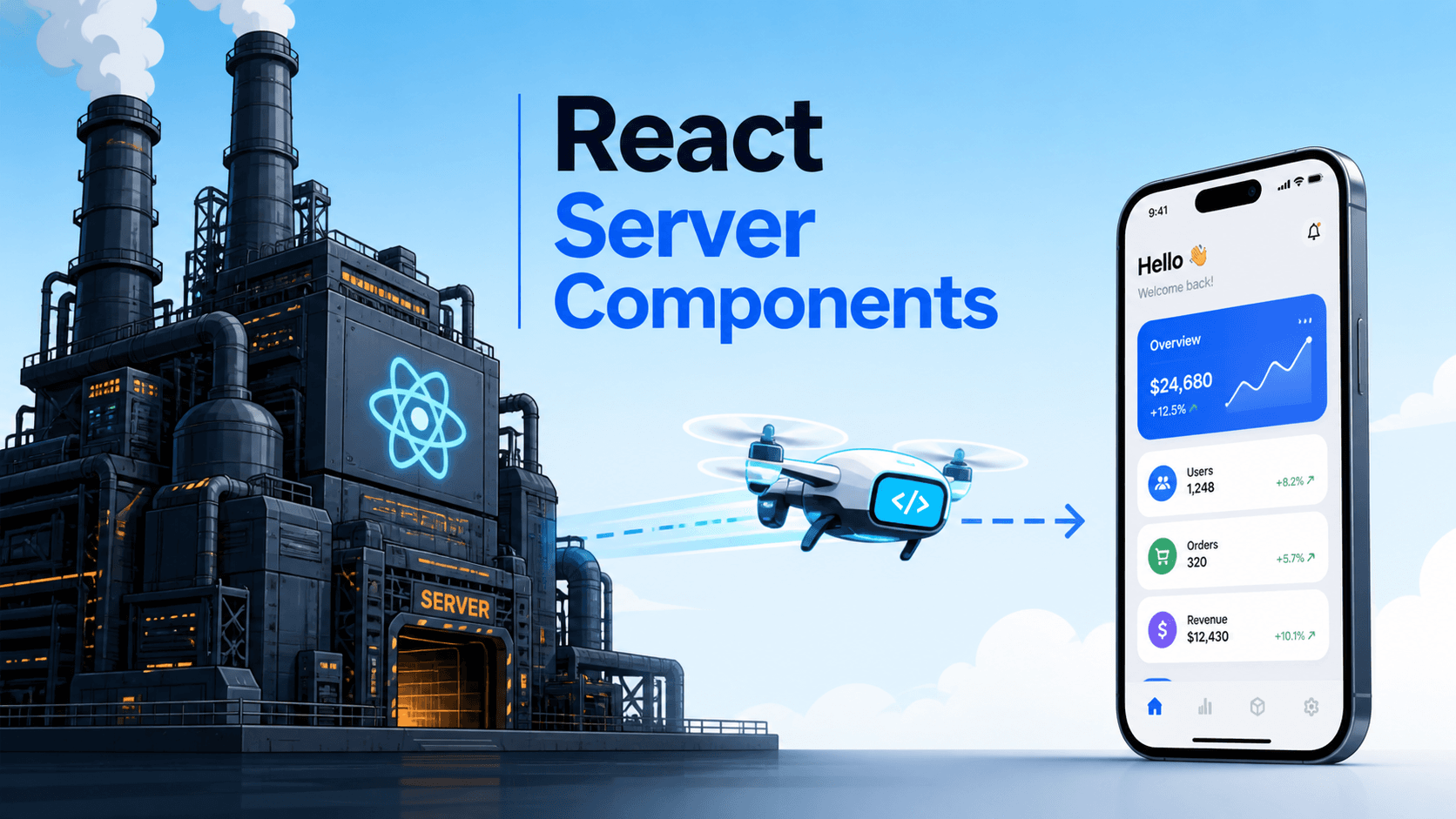
The Spine: Layout, Routes, Data
Three concerns to separate from day one:
- Layout — chrome that's the same across pages. Header, sidebar, breadcrumbs.
- Routes — the page-level units.
/dashboard,/dashboard/billing,/users/:id. - Data — what each widget needs.
In Next.js App Router, this maps cleanly: app/layout.tsx for chrome, app/dashboard/page.tsx for routes, individual server components for widgets. The pattern is the same in TanStack Router, Remix, or React Router — the names change, the shape doesn't.
// app/layout.tsx — server component, runs once
export default function RootLayout({ children }) {
  return (
    <html>
      <body>
        <Providers>
          <Header />
          <Sidebar />
          <main>{children}</main>
        </Providers>
      </body>
    </html>
  );
}

// app/(dashboard)/dashboard/page.tsx
export default async function Dashboard() {
  return (
    <Grid>
      <Suspense fallback={<WidgetSkeleton />}>
        <RecentOrders />
      </Suspense>
      <Suspense fallback={<WidgetSkeleton />}>
        <ActiveUsersChart />
      </Suspense>
      <Suspense fallback={<WidgetSkeleton />}>
        <RevenueOverview />
      </Suspense>
    </Grid>
  );
}
Each widget gets its own Suspense boundary — they stream in independently. The user sees the layout and skeletons within ~100ms; the widgets fill in as their data arrives. This is the single most impactful "feels fast" pattern for dashboards.
Per-Widget Suspense, Not Per-Page
The mistake to avoid: one Suspense boundary around the entire dashboard. With three widgets that each take 200ms, the user waits 600ms (the slowest one) before anything shows up. With per-widget boundaries, the fastest widget appears at 100ms and the rest stream in. Same total network time, dramatically better perceived performance.
This is the part where dashboards built on the App Router (or any RSC framework) leap ahead of classic React. The framework streams the rendered HTML for each Suspense region as soon as its data is ready.
If you're not on RSC, the equivalent is per-widget queries with useSuspenseQuery or careful useQuery + skeleton state, each rendering when its data arrives.
Multi-Tenant Data Scoping
SaaS dashboards almost always have a workspace (organization, account, team). Every query is implicitly scoped to it. Two patterns that scale:
Tenant in the cache key:
function useOrders() {
  const tenantId = useCurrentTenant();
  return useQuery({
    queryKey: ['orders', tenantId],
    queryFn: () => api.getOrders(tenantId),
  });
}
When the user switches workspaces, queries for the old tenant become unused, GC'd from cache, and the new tenant's data fetches independently. Everything stays scoped.
Tenant in the URL:
/workspaces/:workspaceId/dashboardThe workspace is part of the route, which means switching workspaces is a navigation. URLs are shareable; sending a teammate a dashboard link puts them in the right workspace. The downside is more URL parameters; the upside is correctness — you can't accidentally show one workspace's data on another's dashboard.
For most B2B dashboards, both: the workspace is in the URL and in cache keys. Belt-and-braces.
Permissions, Visible And Enforced
Dashboards are permission-heavy. A user might be admin of one workspace and viewer of another. The right pattern has two layers:
- Server enforcement. The API rejects requests the user shouldn't make. This is the only line that matters for security. Anything client-side is convenience.
- Client visibility. Hide actions the user can't perform. Show clear "you don't have access" states for the ones they can see but not act on.
function Toolbar({ workspace }) {
  const { canEdit, canDelete } = usePermissions(workspace);
  return (
    <div>
      <Button>Export</Button>
      {canEdit && <Button>Edit settings</Button>}
      {canDelete && <Button variant="danger">Delete workspace</Button>}
    </div>
  );
}
Don't hide too aggressively — a viewer who can't see any admin actions can't tell who could help them. Showing disabled actions with a tooltip ("Ask an admin to enable") is often the right middle ground.

The Data Layer: One Source Of Truth Per Resource
Dashboards typically read the same resource in multiple places — the user count appears in the header, the sidebar, the dashboard widget, and the deep-link page. If each component fetches independently, you have four requests, four cache copies, and four ways for them to disagree.
The discipline that scales: one query hook per resource, used everywhere:
// shared/hooks/useUsers.ts
export function useUsersList(workspaceId) {
  return useQuery({
    queryKey: ['users', workspaceId],
    queryFn: () => api.users.list(workspaceId),
    staleTime: 60_000,
  });
}

// header
function HeaderUserCount() {
  const wsId = useCurrentTenant();
  const { data } = useUsersList(wsId);
  return <span>{data?.length ?? '—'} users</span>;
}

// dashboard widget
function UsersWidget() {
  const wsId = useCurrentTenant();
  const { data } = useUsersList(wsId);
  return <div>{data?.length} active</div>;
}
TanStack Query (or SWR) deduplicates by key. Two consumers of ['users', 1] share one fetch. Mutations invalidate the key once and every consumer sees the new value.
Don't write resource-specific endpoints inside components. Wrap every fetch in a hook in a shared layer. Six months in, when you need to add filtering or change the URL shape, you change it in one place.
Performance Budgets That Mean Something
Dashboards drift toward "slow" because each individual feature looks fine on its own. The cumulative effect is what bites. A few budgets that hold:
- Initial JS bundle: under 200KB gzipped for the dashboard route. Above that, time-to-interactive on slow devices gets painful.
- Widget render: under 5ms in the Profiler for a typical workspace size. Above that, the dashboard feels sluggish on click.
- Largest widget: virtualised if it can show more than ~100 rows. Always.
- Per-widget data fetch: under 500ms p95 on staging. Otherwise the streaming UX falls apart.
These aren't strict laws — they're checkpoints. When you breach one, ask why. Usually the fix is route-level code splitting, a chart library swap, or virtualising a list that grew.
State, Carefully Categorised
We covered this in the state-management article, but it's especially important in dashboards. Four categories:
- URL state: which page, which tab, which filter, which date range. The URL owns it. Deep-linkable, shareable, history-capable.
- Server state: the actual data. TanStack Query / SWR.
- Local UI state: dropdown open, modal visible, form draft.
useStatenear the consumer. - Cross-cutting UI state: theme, sidebar collapsed, command-palette open. A small Zustand store.
Avoid putting any of these in the wrong category. A filter in useState (instead of the URL) means a refresh loses it. A user record in useState (instead of TanStack Query) means three components fetch it independently. The right home for each kind of state isn't a matter of taste — it's a matter of what surface owns the value.
Real-Time Updates Without Drama
Dashboards often want live data: queue depth, recent events, online users. Three patterns that scale:
- Polling.
refetchInterval: 5000in TanStack Query. Cheap to implement, fine for low-frequency updates. The default for "real-time-ish". - Server-Sent Events. A long-lived connection where the server pushes updates. More efficient than polling for many slow updates.
- WebSockets. Bi-directional, lowest latency, most infrastructure. Reach for them when you need true sub-second freshness or you're sending data both ways (chat, presence, collaborative cursors).
For most SaaS dashboards, polling at 5–15 second intervals covers 80% of "live" needs. Save WebSockets for the parts where the latency matters.
A pattern that works well: poll the query, but pause when the tab is hidden:
useQuery({
  queryKey: ['queue-depth'],
  queryFn: api.getQueueDepth,
  refetchInterval: 5000,
  refetchIntervalInBackground: false,    // pause when tab hidden
});
The user doesn't pay (in CPU or API quota) for a tab they can't see.
The Honest Performance Trade-Off
Dashboards have an unusual property: the most-used page is usually the home page, and the most-used user is usually the one with the most data. So the worst-case performance is more visible than in most apps.
Two habits help:
- Test with realistic data sizes. "Works for 10 rows" tells you nothing. Seed with 10k, see what breaks.
- Profile on a mid-tier laptop, not a maxed-out dev machine. If it's smooth on an M1 Pro, that doesn't mean it's smooth on a five-year-old ThinkPad.
The performance article covers the techniques; here, the discipline is checking with realistic users in mind before shipping.
Onboarding And Empty States
A dashboard's empty state is part of its architecture, not an afterthought. New workspaces have no data. Demos have synthetic data. The widget that says "0 orders, 0 revenue, 0 events" is the first impression a paying customer gets.
Components should handle three states explicitly:
function OrdersWidget() {
  const { data, isLoading, error } = useRecentOrders();
  if (isLoading) return <Skeleton />;
  if (error) return <ErrorCard />;
  if (!data?.length) return <EmptyOrdersState />;     // <- often forgotten
  return <OrdersList orders={data} />;
}
The EmptyOrdersState is where you guide the new user — link to "create your first order", show a sample, explain what they'll see here. Skipping this is one of the most common UX failures in SaaS dashboards.
A Reference Architecture, In One Place
For a typical multi-tenant SaaS dashboard:
- Framework: Next.js App Router (or Remix, or TanStack Router).
- Layout: server component at the root with header / sidebar / providers.
- Routes: server component pages with per-widget Suspense.
- Data layer: shared hooks (one per resource) using TanStack Query.
- Mutations: optimistic for low-stakes; explicit confirmation for destructive.
- Cache scoping: tenant in the query key, also in the URL.
- State: URL for filters/pagination, query for data, useState for local UI, small Zustand store for cross-cutting UI.
- Permissions: enforced server-side, surfaced client-side via a
usePermissionshook. - Real-time: polling by default, SSE for high-frequency, WebSocket only when you really need it.
- Testing: characterisation tests on critical flows, MSW for the data layer, Playwright for the smoke checks.
Nothing exotic. The reason the combination works is that each layer has a clear owner — the data layer doesn't know about UI state, the URL is one of several state homes, permissions are visible in the JSX, and per-widget Suspense means slow data never blocks fast data.
The shortest correct version: dashboards reward separation of concerns more than any other React app shape, because every concern is asked to scale at a different rate. Get the spine right and the features land easily for years.