
So, you've been on the team that argued about a button color for a week.
Not whether it should be blue. That part was easy. The fight was about which blue. Marketing's PowerPoint used #1B6FD8. The web app shipped with #1D6FE0 because someone eyeballed it from the Figma. iOS hardcoded UIColor(red: 0.10, green: 0.43, blue: 0.86). Android had @color/brand_primary pointing at #1976D2 from the Material defaults. The customer screenshot the support team forwarded had all four blues stacked next to each other in the same email signature.
This is the problem design tokens exist to solve. Not "we want pretty colors." Not "we want a design system." The very specific, very unglamorous problem of: the same color, the same spacing, the same font scale, appearing in five places, owned by four teams, and somehow staying identical through three years of product changes.
A design token is the smallest possible answer to that. A name, a value, a place where the value is allowed to live. color-accent is #1B6FD8. The web reads it from a CSS variable. iOS reads it from an asset catalog. Android reads it from colors.xml. When marketing tweaks the brand and the blue shifts a few degrees, you change one row in one JSON file, regenerate, and every surface follows.
That's the pitch. The rest is the mess of making it actually work.
What A Token Actually Is (And What It Isn't)
A token, in the cleanest possible form, is a key-value pair plus a type:
{
  "color": {
    "accent": { "value": "#1B6FD8", "type": "color" },
    "danger":  { "value": "#D14343", "type": "color" },
    "muted":   { "value": "#6B7280", "type": "color" }
  }
}
That's it. The JSON file is the source of truth. Everything downstream - CSS variables, Swift enums, Android XML, Tailwind config, Figma styles - gets generated from it. The token is the promise that all of those derived artifacts will agree.
What's not a token is anything that varies meaningfully across surfaces. A component's height, the precise opacity of a hover state, the specific blur radius of a card shadow on iOS - these can live in tokens if you want, but they often don't survive contact with platform conventions. iOS has its own elevation system. Android has Material's. Trying to force the exact same box-shadow value into all three usually ends with engineers quietly overriding it locally, which means the token has stopped being a contract and started being a polite suggestion.
The good first rule is: token the things that should be identical across surfaces, and let the things that should be idiomatic vary. Brand colors are identical. Semantic spacing (the size of a "comfortable gap between two paragraphs") is identical. The exact shadow on a dropdown? Probably platform-idiomatic. Don't fight the OS on that one.
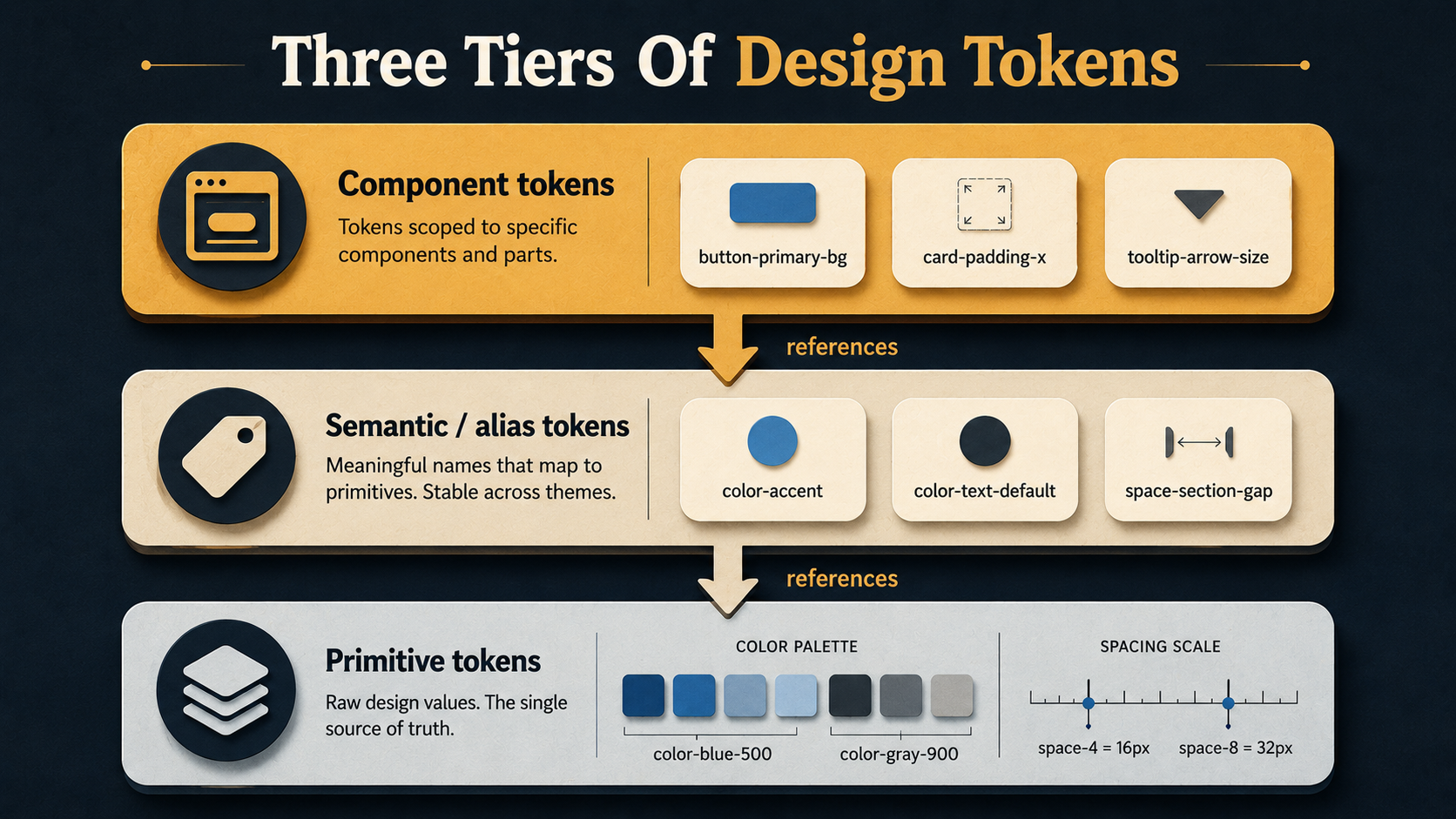
The Three Tiers Nobody Tells You About Up Front
Here's the part that gets every team. You start with a flat list - color-blue, color-red, color-green - and within a quarter you realize you have no idea which blue is "the button blue" versus "the link blue" versus "the chart-line blue." They're all #1B6FD8 today. They might not be tomorrow.
Mature token systems handle this with tiers, also called token layers. There are usually three:
- Primitives (or "base", "global") - the raw palette. Hex values, no semantic meaning.
color-blue-500,space-4,font-size-3xl. This is the chemistry set. - Semantic (or "alias") - meaning, not appearance.
color-accent,color-text-default,color-border-subtle,space-section-gap. These point at primitives. You change what "accent" means by retargeting the alias, not by editing the primitive. - Component-specific - the narrow ones.
button-primary-background,card-padding-x,tooltip-arrow-size. These point at semantic tokens. They exist so that when a designer says "make the primary button background slightly more saturated," you can do it without changing every other surface that uses the accent color.
{
  "color": {
    "accent":            { "value": "{color.blue.500}", "type": "color" },
    "accent-hover":      { "value": "{color.blue.600}", "type": "color" },
    "text-default":      { "value": "{color.gray.900}", "type": "color" },
    "text-muted":        { "value": "{color.gray.500}", "type": "color" },
    "border-subtle":     { "value": "{color.gray.200}", "type": "color" },
    "background-canvas": { "value": "{color.gray.50}",  "type": "color" }
  }
}
The arrow syntax ({color.blue.500}) is borrowed from the Design Tokens Community Group spec and the most common tool that consumes it, Style Dictionary. The exact syntax varies - Tokens Studio uses curly braces, some teams use dot notation, GitHub's Primer uses YAML - but the idea is universal. A semantic token resolves to a primitive at build time.
The mistake almost every team makes is starting with semantic tokens and skipping primitives. "We don't need color-blue-500 because we only have one blue." You will have more than one blue. The day you do, you'll discover that ten components reference color-accent directly with no shared underlying palette, and a "small palette adjustment" turns into a hand-edit of ten unrelated files.
Start with primitives. Always.
Colors: The One Everyone Gets Wrong First
Colors look like the easy axis. They're not. Three pitfalls eat teams up:
Pitfall one: a flat palette of named colors. red, blue, green, dark-blue, light-blue, that-other-blue. Six months later, "dark-blue" is darker than "that-other-blue" on dark mode but lighter on light mode, and nobody can remember why. The fix is a scale - blue-50 through blue-900, with consistent perceptual steps. Tailwind popularized this. Material and IBM Carbon both ship pre-built scales. You don't have to roll your own unless your brand is unusual, but you do need to use one.
Pitfall two: no semantic layer. Components reference primitives directly. bg-blue-500 is everywhere. Then dark mode arrives, and you discover that "the accent color" is genuinely different in dark mode - it's blue-400 because blue-500 doesn't have enough contrast on a dark background. Now you have to find every blue-500 and decide, case by case, whether it should switch. Without an alias layer, this is a grep-and-judgment-call job. With one, you change color-accent to point at blue-400 in the dark theme and you're done.
Pitfall three: encoding light/dark by repeating tokens. People reach for color-accent-light and color-accent-dark as separate tokens. That works until you add a third theme - high-contrast, brand variant, white-label - and now you have color-accent-light, color-accent-dark, color-accent-hc, color-accent-corp, and the component template is a mess of conditionals. The better shape is one semantic token (color-accent) with theme-specific values:
{
  "color": {
    "accent":        { "value": "{color.blue.500}" },
    "text-default":  { "value": "{color.gray.900}" },
    "background":    { "value": "{color.gray.50}" }
  }
}{
"color": {
"accent": { "value": "{color.blue.400}" },
"text-default": { "value": "{color.gray.100}" },
"background": { "value": "{color.gray.950}" }
}
}Same names, different values. Components only ever reference color-accent. The theme switch swaps the resolution. You can add a fourth theme without touching a single component.
One last colors note: store colors in a format that round-trips well. Hex is fine for most uses. If you do anything with color math (mixing, contrast checking, hue rotation), prefer HSL or OKLCH at the primitive layer. OKLCH in particular has gotten broad browser support and is much friendlier for generating perceptually-even scales than hex - but it's a "use if you have a reason" choice, not a default.
Spacing: The Quietly Important One
Most teams underweight spacing tokens because spacing feels less obviously wrong than colors. A button that's 14px tall instead of 16px doesn't look broken; it just looks slightly off. Multiply that across a hundred components and what you get is the unmistakable feeling of a UI that "doesn't quite fit together," which the designers will call "polish" and the engineers will call "vibes," and nobody will be able to point at a specific bug.
The fix is a scale, not a freeform list. Pick a base unit - 4px is the de-facto industry standard, 8px is the older school - and define every spacing token as a multiple of it:
{
  "space": {
    "0":  { "value": "0",     "type": "dimension" },
    "1":  { "value": "4px",   "type": "dimension" },
    "2":  { "value": "8px",   "type": "dimension" },
    "3":  { "value": "12px",  "type": "dimension" },
    "4":  { "value": "16px",  "type": "dimension" },
    "6":  { "value": "24px",  "type": "dimension" },
    "8":  { "value": "32px",  "type": "dimension" },
    "12": { "value": "48px",  "type": "dimension" },
    "16": { "value": "64px",  "type": "dimension" },
    "24": { "value": "96px",  "type": "dimension" }
  }
}
Note the gaps. You don't define every multiple. The scale should have opinions - "use 16px or 24px, don't use 18px" - because the moment 18px is a legal value, somebody will use it, and your "consistent rhythm" is now five pixels off in one place. T-shirt sizing (xs, sm, md, lg, xl) works too but loses information; numeric scales are easier to extend.
Then add a semantic layer on top:
{
  "space": {
    "inline-tight":   { "value": "{space.1}" },
    "inline-default": { "value": "{space.2}" },
    "stack-tight":    { "value": "{space.2}" },
    "stack-default":  { "value": "{space.4}" },
    "stack-loose":    { "value": "{space.8}" },
    "section-gap":    { "value": "{space.16}" }
  }
}
Now a component template reads padding: var(--space-inline-default) instead of padding: 8px. When the brand redesign comes in two years and the team decides to loosen up the rhythm everywhere, you change space-inline-default from {space.2} to {space.3} and the entire UI breathes a little more. One file. One PR.
This is where multi-platform consistency gets quietly powerful. A "section gap" on the web is 64px. On iOS, the layout helpers want CGFloat(64). On Android, you want 64dp. All three are emitted from the same source token, and the Style Dictionary build is what knows to spit out px for web, pt for iOS, and dp for Android.
Typography: The Hardest Axis
Typography is where token systems quietly fall apart, because typography isn't one value - it's a composite. A "heading" isn't a font size. It's a font-family, a size, a weight, a line-height, a letter-spacing, and sometimes a transform.
Two patterns work, depending on team size.
Pattern one: composite tokens. Group everything that makes up a text style into a single token, and consume it as a bundle:
{
  "typography": {
    "heading-xl": {
      "value": {
        "fontFamily":  "{font.sans}",
        "fontSize":    "{font-size.4xl}",
        "fontWeight":  "{font-weight.bold}",
        "lineHeight":  "{line-height.tight}",
        "letterSpacing": "-0.02em"
      },
      "type": "typography"
    }
  }
}
This is the Design Tokens spec's recommended shape and what Figma's Tokens Studio emits. The win is that "heading-xl" is one named thing - designers and engineers both reach for the same concept. The cost is that on the web you have to expand the composite into individual CSS rules, because CSS doesn't have a single typography property; you have to set font-size, font-weight, and line-height separately.
Pattern two: keep the axes separate. Each property gets its own token. font-size-4xl, font-weight-bold, line-height-tight. Components compose them. This is what Tailwind does, and it scales well in code but loses the named text style. Designers say "use heading XL" and engineers have to remember that means size 4xl + weight bold + leading-tight + tracking-tight. It works, but it's more rope.
Most teams that ship across platforms end up with a hybrid: composite tokens for the canonical text styles (heading-xl, body-default, caption), and primitives for the axes underneath so the rare custom case can mix and match.
One sharp edge: line-height in design tools is usually a number ("auto" or a unitless multiplier), but on web you often want it as a unitless number, on iOS as a fixed point value, and on Android as sp. The transformer in your token pipeline (more on this in a second) is the thing that knows which platform wants which format. Don't try to encode the units in the token value itself.
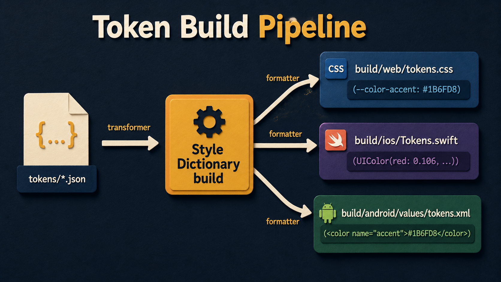
How Multi-Platform Consistency Actually Works
So far this has been "you write tokens in JSON." The interesting question is how the same JSON ends up as --color-accent: #1B6FD8; on web and Color.accent on iOS and <color name="accent">#1B6FD8</color> on Android without you maintaining three copies.
The standard tool here is Style Dictionary - an open-source CLI by Amazon that reads a tokens file and emits platform-specific output files. You define transformers (how a value is converted: px to dp, hex to UIColor literal) and formatters (what the final file looks like: SCSS variables, Swift enum, XML resource).
A minimal config looks like this:
module.exports = {
  source: ['tokens/**/*.json'],
  platforms: {
    web: {
      transformGroup: 'css',
      buildPath: 'build/web/',
      files: [{
        destination: 'tokens.css',
        format: 'css/variables'
      }]
    },
    ios: {
      transformGroup: 'ios-swift',
      buildPath: 'build/ios/',
      files: [{
        destination: 'Tokens.swift',
        format: 'ios-swift/class.swift',
        className: 'Tokens'
      }]
    },
    android: {
      transformGroup: 'android',
      buildPath: 'build/android/res/values/',
      files: [{
        destination: 'tokens.xml',
        format: 'android/resources'
      }]
    }
  }
};
You run style-dictionary build and out comes three files. On web you get:
:root {
  --color-accent: #1B6FD8;
  --color-text-default: #1F2937;
  --space-stack-default: 16px;
}
On iOS, Swift:
public class Tokens {
    public static let colorAccent      = UIColor(red: 0.106, green: 0.435, blue: 0.847, alpha: 1.0)
    public static let colorTextDefault = UIColor(red: 0.122, green: 0.161, blue: 0.216, alpha: 1.0)
    public static let spaceStackDefault: CGFloat = 16
}
On Android, XML:
<resources>
  <color name="color_accent">#1B6FD8</color>
  <color name="color_text_default">#1F2937</color>
  <dimen name="space_stack_default">16dp</dimen>
</resources>
Same JSON. Three outputs. The transformer handled the format conversions - hex stays hex on web and Android, becomes a normalized RGB on iOS. 16px stays 16px on web, becomes a CGFloat on iOS, and becomes 16dp on Android. Nobody hand-edits the generated files. They're treated like compiler output - committed (or not, depending on your build setup) and never edited directly.
There are alternatives. Theo is Salesforce's older take on the same idea. Tokens Studio is a Figma plugin that lets designers maintain the tokens visually and exports the same JSON shape. Some teams roll their own pipeline because their setup is unusual - Shopify's Polaris and GitHub's Primer both have homegrown token pipelines. But Style Dictionary is the boring, well-supported default and a fine place to start.
The Team Side: Where Tokens Actually Live Or Die
Tools aren't the hard part of tokens. The hard part is the workflow between design and engineering.
The pattern that works most reliably:
- Designers own the source of truth in Figma. Tokens Studio (or Figma Variables, which is the native version Figma rolled out in 2023) keeps the tokens as Figma assets. Designers pick from them in the design file rather than typing hex values.
- The token JSON is exported from Figma to the repo. Tokens Studio writes to a Git repo directly. Figma Variables exports JSON via the REST API. Either way, the JSON lives in version control, and a PR is opened when tokens change.
- Engineering reviews the PR. Not for taste - the designers own taste - but for breakage. Did anyone rename a token that's in use? Did the contrast ratio of
color-text-defaultoncolor-backgrounddrop below WCAG AA? Did the typography composite suddenly get a font that doesn't exist on Android? - Merge triggers a rebuild. Style Dictionary regenerates platform files. CI publishes a new version of the tokens package. Apps pick it up on their next dependency bump.
This sounds heavy. In practice it's lighter than the alternative - which is design and engineering both editing their own files for the same change and discovering the drift six weeks later.
The thing that makes it work is treating tokens as versioned and breaking-change-aware. The tokens package gets its own semver. Renaming color-primary to color-accent is a major bump. Adding color-warning is a minor. Adjusting the hex of color-accent from #1B6FD8 to #1D70DA is a patch - same name, same semantic meaning, slightly different appearance. Apps subscribe to the level of update they want.
Where It Gets Genuinely Hard
A few problems no token system solves cleanly:
Component-specific tokens balloon. You start with semantic tokens. Then a designer asks for a slightly different shade for the danger button's hover state - not red-600, not red-500, something between. You add button-danger-hover-bg. Repeat that pattern across 40 components and you've got 200 component tokens, half of which are used once. The fix is discipline: a component-specific token has to earn its existence. If "use semantic + a small adjustment in CSS" works, do that. Reserve component tokens for the case where the override would otherwise appear in three or more places.
Theming gets exponentially complex. Two themes is easy. Light and dark. Three themes is manageable. By the time you have a brand-A theme, a brand-B theme, light and dark for each, plus a high-contrast accessibility mode, you have eight variants of every semantic token. The way out is to limit what each new theme is allowed to change - most themes should only retarget aliases, not redefine the primitive palette - but this is a governance problem more than a tooling one.
Designers and engineers have different vocabularies. Designers will name a token text-emphasis. Engineers will look at it and think it means "emphasized text," but the designer means "the text color used for emphasizing things," and these are different in three components. Documentation in the token file (a description field for each token) and a Storybook page that shows every semantic token rendered next to its name is the cure. It seems like overhead until you've explained the same naming question three times.
Tokens hide intent. Once everything is a token, code reviews can't tell whether padding: var(--space-stack-loose) was a deliberate choice or somebody auto-completed it. Add a one-line comment when the choice matters: // extra breathing room before the summary block - designers approved 32px specifically here. The token didn't make this decision self-explanatory. You still need to write that comment.
What To Build First
If you don't have tokens yet and you're staring at this article wondering where to start, the smallest useful first slice is:
A single tokens/color.json file with a primitive palette (the full scale of each brand color, plus grays) and just enough semantic aliases to cover what your current components actually do - typically text-default, text-muted, background-canvas, border-subtle, accent, and danger. That's six aliases. Run Style Dictionary against it. Output :root CSS variables. Replace the hardcoded hex values in your two or three most-edited components with those variables.
Don't try to token everything at once. Don't add spacing, typography, and shadows on day one. The migration is the expensive part, and a token system that survives is the one where adoption catches up with definition. Add the next axis when the first one has actually been adopted by enough of the codebase that the next color tweak is a one-PR change instead of a treasure hunt.
The teams that succeed with tokens are not the ones with the most thorough taxonomy. They're the ones who picked a small scope, made it real, and grew the system in the direction the product pulled them. Start there.


