
Open your dev tools, switch to the Network tab, refresh a typical content site, and sort by size. The top of the list is almost always images. Not your bundle. Not your JSON. A 2.3MB hero photo, a 1.8MB "team" portrait somebody dropped in straight out of their phone, and four product shots that were exported at 4096px because the designer's monitor is 4K.
This is the failure mode Nuxt Image is built to fix. The mental model is small enough to fit on a napkin: you keep authoring with one source file, the framework hands the browser a perfectly-sized version, in the right format, for the screen that's actually loading it. Everything else (the IPX server, the providers, the sizes attribute soup) is plumbing.
Let's walk through the plumbing. Not because it's interesting on its own (it isn't), but because the defaults Nuxt picks are reasonable in some cases and actively wrong in others, and you can't tell which is which until you understand what's happening underneath.
The whole module in one paragraph
You install @nuxt/image, add it to modules, replace your <img> tags with <NuxtImg>, and that's the surface API. Underneath, Nuxt boots an IPX server, a Nitro route that wraps unjs/ipx, which itself wraps lovell/sharp, the libvips-backed image processing library. When the browser requests /_ipx/w_640,f_webp/hero.jpg, IPX reads public/hero.jpg, asks Sharp for a 640px-wide WebP, caches the result, and streams it back. That's the entire act.
export default defineNuxtConfig({
  modules: ["@nuxt/image"],
  image: {
    quality: 80,
    format: ["avif", "webp"],
    screens: {
      sm: 640,
      md: 768,
      lg: 1024,
      xl: 1280,
      xxl: 1536,
    },
  },
});
Three things to clock in that config. quality: 80 is the value most CDNs and image guides land on after benchmarking, high enough that the eye doesn't notice loss on photos, low enough to halve file size on JPEGs. format: ["avif", "webp"] says "try AVIF first, fall back to WebP", relevant for <NuxtPicture>, which we'll get to. And the screens block is the breakpoint dictionary that the sizes attribute reads from later. The xs and xxl defaults were trimmed in v2 to match Tailwind's conventions. If you upgraded from v0 and your responsive images suddenly look off, that's where to look.
<NuxtImg> vs <NuxtPicture>: pick the right tool
These render different DOM. They are not interchangeable. The names sound similar, the props overlap, and that is exactly why people pick the wrong one.
<NuxtImg> renders a single <img> tag. The src is rewritten to go through IPX, and if you provide sizes and densities, you get a srcset so the browser can pick the right URL for the current viewport. The browser does the heavy lifting. It parses sizes, looks at the viewport width and DPR, and asks for one image.
<NuxtPicture> renders a <picture> element with <source> tags for each format you requested, plus a fallback <img>. The browser walks the <source> list top-to-bottom, picks the first format it understands, and never even requests the others. This is the only way to ship AVIF with a WebP fallback for older Safari.
The practical rule: use <NuxtPicture> when you want format negotiation, use <NuxtImg> for everything else. Content images, avatars, decorative shots, icons: they're all <NuxtImg>. Hero images and anything where AVIF's 30-50% byte savings actually matter: <NuxtPicture>.
<template>
  <NuxtPicture
    src="/photos/hero.jpg"
    format="avif,webp"
    sizes="sm:100vw md:80vw lg:1024px"
    :img-attrs="{ alt: 'A long boardwalk through marsh grass at sunrise' }"
    loading="eager"
    fetchpriority="high"
  />
</template><template>
<NuxtImg
:src="user.photo"
width="48"
height="48"
densities="x1 x2"
loading="lazy"
:alt="`Photo of ${user.name}`"
/>
</template>Two different jobs, two different components. Don't reach for <NuxtPicture> on every image. You'll pay for it in extra DOM and slightly worse JSON-LD hygiene for image SEO.
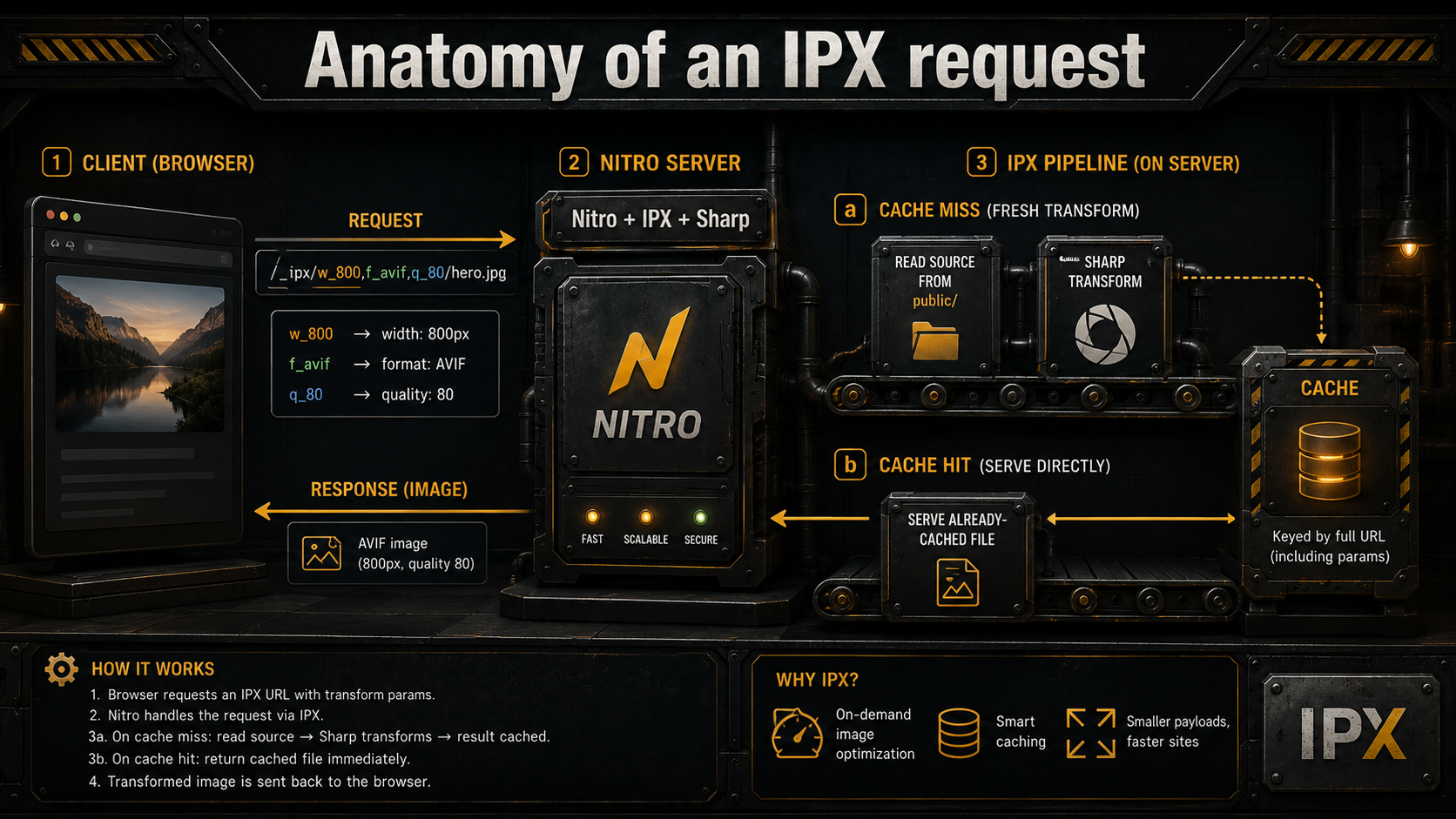
What IPX actually does to your request
Here's the part most tutorials skip. IPX is not a content-delivery network. It's a runtime image processor that lives inside your Nitro server, transforms images on demand, and caches the result on disk (or in memory, depending on preset).
The URL pattern carries the transform. /_ipx/w_800,f_avif,q_80/cats/luna.jpg decodes as: width 800, format AVIF, quality 80, source cats/luna.jpg (resolved against dir, which defaults to public/). IPX parses that, calls Sharp with the matching operations, and writes the result. On the next request for the same URL, the cached file is served directly. This is the same trick Vercel Image Optimization, Cloudflare Images, and Imgix all use. The only differences are where the cache lives and who pays the bandwidth bill.
Two things follow from this that matter operationally:
Cold start is expensive. The first hit on a new size is a Sharp resize, which is CPU-bound. If you deploy and immediately point a load test at your homepage with thirty unique image URLs, you'll see the latency spike. Sharp can do astonishing throughput once warm, but the first 30 conversions are a wall. Pre-warm with nitro.prerender.routes if you're cutting it close.
The cache is yours. With the default IPX provider, the transformed images live on whatever filesystem your server is running on. That's fine for a single Nitro container, painful for autoscaling fleets (every replica re-converts from scratch), and a real problem on serverless platforms where the disk vanishes between cold starts. If you're on Vercel or Cloudflare, switch providers. They have their own optimization endpoints that solve this for you.
The sizes attribute is doing more than it looks
This is the attribute everyone copies from a tutorial without understanding, and it's the one that controls whether your responsive setup actually works.
The browser uses sizes to decide what width image to download from srcset. It does this before the image has loaded, based on the viewport and the media queries you wrote. If your sizes lies, if it says the image is 100vw when CSS actually constrains it to a 600px sidebar, the browser will dutifully download a 1920px file and squeeze it into 600px.
Nuxt Image's sizes syntax is "responsive-first": you list breakpoint-prefixed sizes, and Nuxt expands them into a CSS media query string and a srcset with the right widths.
<NuxtImg
  src="/article/illustration.jpg"
  sizes="sm:100vw md:50vw lg:33vw"
  alt="..."
/>
The rendered output is something like:
<img
  src="/_ipx/s_640x0/article/illustration.jpg"
  srcset="
    /_ipx/s_320x0/article/illustration.jpg 320w,
    /_ipx/s_640x0/article/illustration.jpg 640w,
    /_ipx/s_768x0/article/illustration.jpg 768w,
    /_ipx/s_1024x0/article/illustration.jpg 1024w
  "
  sizes="(min-width: 1024px) 33vw, (min-width: 768px) 50vw, 100vw"
/>
Read that sizes value carefully. The browser walks it top-to-bottom. At a viewport >= 1024px, the image is 33% of viewport width; at >= 768px, 50%; otherwise 100%. The first one that matches wins. Get the order wrong (largest breakpoint first is the rule) and you'll serve the wrong sizes.
The bug pattern is always the same: developer writes sizes="100vw" because that was the default in the tutorial, the image is actually constrained to a max-width grid, and every visitor downloads a desktop-sized file even on phones. Lighthouse flags it as "Properly size images" and you spend an afternoon figuring out why.
If you can't reason about your image's actual rendered width across breakpoints, the responsive image isn't responsive. It's just heavier than it needs to be in clever costume.
Densities and the retina tax
The other half of "responsive" is pixel density. A 2017-era iPhone has a 3x display, three device pixels per CSS pixel, in both dimensions. That means a 100px-wide CSS avatar is actually 300px of pixels on screen, and if you ship the 100px file, the user sees a slightly fuzzy avatar.
densities solves this. You give Nuxt Image a base width (or let it infer from your CSS), and a list of pixel densities, and it generates a srcset of higher-resolution variants:
<NuxtImg src="/icons/badge.png" width="50" height="50" densities="x1 x2 x3" />Renders to:
<img
  src="/_ipx/w_50/icons/badge.png"
  srcset="
    /_ipx/w_50/icons/badge.png 1x,
    /_ipx/w_100/icons/badge.png 2x,
    /_ipx/w_150/icons/badge.png 3x
  "
  width="50"
  height="50"
/>
Default is [1, 2]: covers retina, doesn't worry about 3x. Bump to x1 x2 x3 for assets that need to be crisp on flagship phones (logos, icons, photos that are clearly "the subject"). Skip the bump for thumbnails where nobody is going to lean in and squint.
One gotcha: densities and sizes are different concerns, and combining them mostly works but you should think about it. sizes controls "how big in CSS pixels", densities controls "how dense the file is at each CSS size." Most of the time you want both (sizes to describe layout, densities for sharpness) and <NuxtImg> happily handles both. But if you're only doing one (e.g., a fixed-size icon), don't bolt on the other for completeness. Extra srcset entries mean the browser computes more candidates, which is cheap but not free.
CLS, width, height, and the most preventable Lighthouse hit
The single biggest source of Cumulative Layout Shift on content sites is images that load and push everything below them downward. The fix has been in the HTML spec for years and is somehow still not universal: always set width and height attributes (in any unit, but typically the intrinsic image dimensions). Modern browsers compute aspect-ratio from those, reserve the slot before the file arrives, and your layout stops jumping.
<NuxtImg
  src="/team/sarah.jpg"
  width="800"
  height="1000"
  sizes="sm:100vw md:400px"
  alt="..."
/>
The actual CSS size of the image will be whatever sizes and your stylesheet say. The width/height attributes are not "render at 800x1000 pixels"; they're "this image's intrinsic aspect ratio is 4:5, please reserve that slot in the layout." Browsers have understood the distinction since 2020. There is no downside.
The CMS case is the one people get stuck on. If you're rendering blog images from Strapi, Sanity, or Directus, the editor uploads a file and you don't know the dimensions until you fetch it. Two answers: ask the CMS to store and return dimensions (every modern headless CMS does this: Sanity has metadata.dimensions, Strapi has width/height in the media object, Directus exposes them via the assets endpoint), or use the aspect-ratio CSS property on a wrapper element. Don't ship CMS images without dimensions and hope nobody notices CLS.
LCP, eager loading, and the rule everyone keeps breaking
Largest Contentful Paint is almost always the hero image. Lazy-loading it is one of the most common own-goals in modern web performance.
<img loading="lazy"> defers the image fetch until the browser figures out it's in or near the viewport. For images below the fold, this is a clean win. The browser doesn't waste bandwidth on stuff the user might never scroll to. For the LCP image, it's the exact opposite of what you want. The browser sees the lazy attribute, decides "don't fetch yet", and your LCP metric eats the round trip.
The combination that fixes hero images:
<NuxtImg
  src="/hero.jpg"
  sizes="sm:100vw md:100vw lg:1280px"
  loading="eager"
  fetchpriority="high"
  preload
  width="1920"
  height="1080"
  alt="..."
/>loading="eager": fetch immediately, don't wait for intersection observer.
fetchpriority="high": tell the browser this is the page's most important resource, so it gets bumped ahead of other "high priority" defaults like the first few render-blocking scripts.
preload: Nuxt Image emits a <link rel="preload" as="image"> in the document head, which starts the request before the body of the document is even parsed.
For every other image on the page, the inverse rule applies: loading="lazy", fetchpriority="low". Web.dev's LCP optimization guide calls this out as one of the most impactful, lowest-effort wins in the entire performance playbook.
The trap is uniformity. Developers either lazy-load everything (and tank LCP) or eager-load everything (and tank Time to Interactive on long pages). Two priorities, two component configurations, applied surgically.
Providers: IPX is fine, until it isn't
The default ipx provider is reasonable for content sites with predictable traffic. It runs on your Nitro server, it's free, and the cache lives on disk. The point at which you should switch is when one of three things becomes true:
Your origin can't take the conversion CPU. Sharp is fast, but on a small VPS with a viral post you'll see your event loop block during cold conversions. The fix is to push image processing to an upstream service (Cloudflare's image resizing, Imgix, Cloudinary, ImageKit) and have it cache at the edge.
You're on a serverless platform without persistent disk. Vercel and Netlify both vanish the filesystem between invocations, so the local IPX cache is useless. They each ship their own image optimization endpoints; Nuxt Image has matching providers (vercel, netlify) that point at them. Use those instead of running IPX on a serverless function.
You're serving from a CDN that already optimizes. Cloudflare's Image Resizing and Cloudflare Images both expose /cdn-cgi/image/<options>/<url> endpoints that do the same job as IPX, but at the edge, with Cloudflare's cache, billed per million requests. The Nuxt Image provider just rewrites your URLs to that format.
Switching is a configuration change, not a code change. Components stay identical:
export default defineNuxtConfig({
  image: {
    cloudinary: {
      baseURL: "https://res.cloudinary.com/your-cloud-name/image/upload/",
    },
    provider: "cloudinary",
  },
});export default defineNuxtConfig({
image: {
provider: "cloudflare",
cloudflare: {
baseURL: "https://your-domain.com",
},
},
});The Cloudflare provider does require flipping a switch in your Cloudflare dashboard first. "Image Transformations" needs to be enabled for the zone, and if you're transforming images from third-party domains, "Resize Image from Any Origin" too. Worth checking before you ship and wonder why the URLs are 404ing.
Static sites and the ipxStatic switcheroo
If you run nuxt generate for a static build, the default provider silently swaps from ipx to ipxStatic. The difference matters.
ipxStatic runs all your image transforms at build time, writes the resulting files to the output directory, and serves them as plain static assets. No IPX server is needed at runtime. Your hosting can be Cloudflare Pages, GitHub Pages, S3 + CloudFront, whatever. This is the right answer for blogs, marketing sites, and docs.
The gotcha is that build-time generation only knows about images Nuxt encounters during crawling. If you have a modal that loads an image only on click, or a dynamically-named image whose URL is computed in JavaScript at runtime, the static crawl won't find it, and the production site will 404. Three fixes:
- Reference the image in markup somewhere that gets crawled (even if it's
display: none). - Add the image URL explicitly to
nitro.prerender.routes. - Move to a runtime provider. At that point you're not really doing static anymore, but if you have a lot of these you might want a real IPX server.
The other quirk: provider options for ipx don't automatically inherit to ipxStatic. If you tuned your IPX config in dev (custom modifiers, alias map, allowed domains) and it works locally with nuxt dev but breaks in production with nuxt generate, this is almost certainly why. Configure ipxStatic explicitly when you do this.
Presets: the underrated feature
Presets are reusable bundles of modifiers. They're the cleanest way to keep image conventions consistent across a codebase without scattering magic-number widths and qualities through every template.
export default defineNuxtConfig({
  image: {
    presets: {
      avatar: {
        modifiers: { format: "webp", width: 80, height: 80, fit: "cover", quality: 80 },
      },
      hero: {
        modifiers: { format: "avif", quality: 85, fit: "cover" },
      },
      cardThumb: {
        modifiers: { format: "webp", width: 480, quality: 75, fit: "cover" },
      },
    },
  },
});
Then in components:
<NuxtImg src="/users/photo.jpg" preset="avatar" alt="..." />
<NuxtImg src="/posts/hero.jpg" preset="hero" sizes="sm:100vw md:1280px" loading="eager" />
The win isn't shaving keystrokes. It's that when product decides every avatar in the app is now 96px instead of 80px, you change one place. Same when you want to bump quality across hero images, or switch all cards from WebP to AVIF for that one client whose users are on browsers that can handle it. Centralized image conventions age better than a thousand inline modifier configs.
A few honest gotchas
These are the things that have eaten enough hours collectively that they deserve their own list, even though this article isn't a tips-list article.
ssr: false neuters static optimization. If you've disabled SSR (single-page app mode) and you're running nuxt generate, Nuxt Image can't optimize during build because there's no server-rendered HTML to crawl. The escape hatch is nitro.prerender.routes listing every image URL. The real fix is usually "turn SSR back on". There's almost no reason to ship a fully client-rendered marketing or content site in 2026.
Default screen breakpoints quietly change between versions. v0 had xs: 320 and xxl: 2560. v2 dropped both to align with Tailwind's defaults. If you upgraded and your responsive images started looking subtly off, your sizes strings are now resolving to different widths than they were before. Set screens explicitly in nuxt.config.ts if you want to lock the behavior.
Provider-specific format quirks. The Cloudflare provider has historically had edge cases with x2 density rendering through <NuxtPicture> (see issue #902). If you switch providers and image quality looks worse, check the provider's GitHub issues before blaming the framework.
Format negotiation in <NuxtPicture> is order-sensitive. format="avif,webp" generates AVIF, WebP, and a fallback in that order. The browser picks the first one it supports. Get the order wrong and you'll silently serve WebP to Chrome users that could have had AVIF.
<NuxtImg> does not give you AVIF + WebP fallback for free. Single <img> tags can't do format negotiation. The browser doesn't know what to fall back to. If you specify format="avif" on <NuxtImg> and a user is on a browser that doesn't support AVIF, the request 404s. AVIF support is now near-universal on the desktop, but if your audience has any meaningful old-Safari tail, reach for <NuxtPicture>.
When you don't need any of this
A counterpoint, because every "use this module" article should have one.
If you're shipping a five-page marketing site with three images, all of them under 200KB, all hand-optimized in Squoosh before commit, you don't need Nuxt Image. A plain <img> with width, height, loading="lazy", and a sensible source format is fine. Adding a runtime image pipeline to a tiny static site adds dependencies, build complexity, and another thing that can break, in exchange for savings that probably round to zero.
The threshold where Nuxt Image starts to pay for itself is roughly: more than a dozen images, or images sourced from a CMS where you don't control the dimensions, or any meaningful audience on mobile where bandwidth and CPU savings translate to real money. Below that bar, the manual approach is more honest about what you're shipping.
Above it, the framework does enough of the right things by default (and the wrong defaults are well-documented enough) that the alternative is genuinely worse.
The shape of a healthy image strategy
The lazy summary is something like: set width and height everywhere, use <NuxtPicture> with format="avif,webp" for hero images, <NuxtImg> with densities and sizes for everything else, eager-load the LCP image, lazy-load the rest, and switch providers when origin CPU starts hurting.
The less lazy summary is that none of those defaults are universal. They're starting points. The reason Nuxt Image is good is that every one of them is a flag you can flip, a prop you can override, a provider you can swap, without leaving the same component API. The reason teams still fail with it is they treat the defaults as gospel and discover the wrong ones the hard way, usually three weeks after launch, in a Lighthouse report somebody else ran.
Treat it like any other piece of infrastructure: understand the layer underneath the magic, learn what the defaults assume, override the ones that don't match your situation, and don't be afraid to bypass the whole thing for the rare images where a hand-tuned <img> is the right answer.
Your image weight, your LCP, and your bandwidth bill will all thank you.


