The first modal is easy. A v-if, an absolutely-positioned div, a backdrop, a close button. Ship it. The second modal copies the first. The third one needs to confirm something before closing. The fourth nests inside the third. By the time you have a real app, you have six slightly-different modal components, none of them handle escape on the same level, and the focus management is "we'll fix it later."
A reusable modal system isn't about generalizing those six components. It's about getting the boring, repeatable parts right once — focus trapping, escape, scroll lock, return focus, accessible markup — so the only thing each consumer cares about is the content.
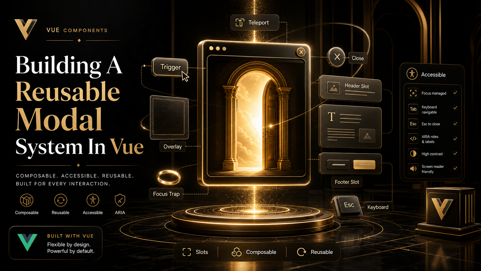
The Foundation: Teleport And A Single Mount Point
A modal that lives inside its parent component inherits stacking and overflow problems. Parent has overflow: hidden? Modal gets clipped. Parent has transform: translate? Modal becomes the new positioning root. Parent has z-index: 1? Good luck.
<Teleport> solves this by moving the rendered DOM elsewhere — usually body:
<template>
  <Teleport to="body">
    <div v-if="open" class="modal-backdrop">
      <div class="modal-panel" role="dialog" aria-modal="true">
        <slot />
      </div>
    </div>
  </Teleport>
</template>
Teleport only moves the DOM. The component still lives in the same tree for state, props, slots, and events. The slot content keeps its original component context, so injected values (theme, router, store) still resolve correctly.
The Native <dialog> Element Is The 2025 Move
Modern browsers all support the native <dialog> element with showModal(). It gives you the inert top layer, automatic backdrop via ::backdrop, and the Escape key for free. For a from-scratch modal in 2025, this is the right primitive:
<script setup lang="ts">
import { ref, watch } from 'vue'

const props = defineProps<{ open: boolean }>()
const emit = defineEmits<{ close: [] }>()

const dialogEl = ref<HTMLDialogElement | null>(null)

watch(() => props.open, (isOpen) => {
  if (!dialogEl.value) return
  if (isOpen) dialogEl.value.showModal()
  else dialogEl.value.close()
})

function onClose() { emit('close') }
</script>

<template>
  <Teleport to="body">
    <dialog ref="dialogEl" @close="onClose" @cancel.prevent="onClose">
      <slot />
    </dialog>
  </Teleport>
</template>
The cancel event fires on Escape; preventing the default lets you handle close yourself (so you can confirm-before-close). The close event fires after the dialog actually closes.
<dialog> handles the inert background, return focus, and the top layer — three things you'd otherwise build by hand. The trade-off: styling the backdrop has to go through ::backdrop, and animation in/out is awkward. For most app modals, the trade-off is worth it.
Focus Trap And Return Focus
If you stick with a custom div-based modal (because you need fine-grained animation control, say), you have to manage focus yourself. VueUse ships useFocusTrap, which wraps focus-trap and gives you a clean API:
<script setup lang="ts">
import { ref, watch } from 'vue'
import { useFocusTrap } from '@vueuse/integrations/useFocusTrap'

const props = defineProps<{ open: boolean }>()
const emit = defineEmits<{ close: [] }>()

const panelEl = ref<HTMLElement | null>(null)
const { activate, deactivate } = useFocusTrap(panelEl, {
  immediate: false,
  escapeDeactivates: true,
  returnFocusOnDeactivate: true,
})

watch(() => props.open, (isOpen) => {
  if (isOpen) activate()
  else deactivate()
})
</script>
returnFocusOnDeactivate: true is the line that matters — when the modal closes, focus goes back to whatever element opened it. That's an accessibility requirement most rolled-from-scratch modals quietly skip.

Body Scroll Lock
When the modal is open, the page underneath shouldn't scroll. The naive overflow: hidden on body causes layout shift on browsers with non-overlay scrollbars, and breaks position on iOS Safari. VueUse handles this with useScrollLock:
import { useScrollLock } from '@vueuse/core'
import { watch } from 'vue'

const isLocked = useScrollLock(document.body)

watch(() => props.open, (isOpen) => {
  isLocked.value = isOpen
})
If you have multiple modals stacked, scroll lock is reference-counted by useScrollLock — locking twice and unlocking once leaves it locked. That matches the behavior you want.
State Ownership: Local Or Global?
Two patterns, picked by the use case:
Local — the modal is bound to a specific screen. Open state lives in the same component as the trigger:
<script setup lang="ts">
import { ref } from 'vue'
const open = ref(false)
</script>

<template>
  <Button @click="open = true">Edit user</Button>
  <UserEditModal v-model:open="open" :user="currentUser" />
</template>
v-model:open (using defineModel<boolean>('open') inside the modal) keeps the state next to the trigger, scoped to the screen. This is the right default.
Global — confirmations, toasts, system-wide dialogs. A composable manages the queue:
// useDialog.ts
import { ref, markRaw, type Component } from 'vue'

type DialogEntry = { id: number; component: Component; props?: Record<string, any> }

const dialogs = ref<DialogEntry[]>([])
let nextId = 0

export function useDialog() {
  function open(component: Component, props?: Record<string, any>) {
    const id = nextId++
    dialogs.value.push({ id, component: markRaw(component), props })
    return () => close(id)
  }
  function close(id: number) {
    dialogs.value = dialogs.value.filter((d) => d.id !== id)
  }
  return { dialogs, open, close }
}
The markRaw is the detail people miss. Component definitions shouldn't be made reactive — Vue would walk their internal structure trying to track changes, and the warnings get loud. markRaw opts the value out of reactivity entirely.
Mount a <DialogHost /> near the root that renders each entry, and any code anywhere can call useDialog().open(ConfirmDialog, { message: '...' }).
Confirm-Before-Close
The slightly-harder requirement that real apps run into: "if the user has unsaved changes, ask before closing." This is where the imperative API shines:
<script setup lang="ts">
const isDirty = ref(false)
const emit = defineEmits<{ close: [] }>()

async function tryClose() {
  if (!isDirty.value) return emit('close')
  const ok = await confirm('Discard changes?')
  if (ok) emit('close')
}
</script>

<template>
  <AppModal :open="open" @close="tryClose">
    <!-- form -->
  </AppModal>
</template>
The modal emits close for all close intents (escape, backdrop, button). The parent decides whether to actually close. Don't put the dirty-check logic inside the modal component itself — that's a leak of feature logic into infrastructure.
What I'd Skip
- Building your own focus trap. Use VueUse's
useFocusTrapor native<dialog>. - A "modal store" in Pinia. A composable with module-level state is enough.
- Closing on backdrop click by default. Make it opt-in — forms shouldn't close from a stray click.
A One-Sentence Mental Model
A modal is two pieces of work: putting the right thing in the DOM, and managing where the keyboard and focus go. Get those right once — Teleport for placement, native <dialog> or VueUse useFocusTrap for behavior, scroll lock for the page underneath — and every modal in the app becomes "what's the content, and how do I open it." That's the system you're trying to build.


