You'll know the moment a component is asking for slots. The PR adds a third boolean prop. Then a headerText. Then a footerText. Then a footerActionLabel. By the time someone writes customHeaderRenderer, the component has stopped being a component and started being a small framework with a configuration file.
Slots are the alternative. The component owns the structure, the parent owns the content. It's a clean split that React people often try to recreate with children, render props, or compound components — and Vue gives you out of the box, with a syntax that handles names, scope, and fallbacks without any glue.
Default Slots Are The 80% Case
Every component starts with one slot. You don't have to name it.
<!-- Card.vue -->
<template>
  <section class="card">
    <slot />
  </section>
</template>

<!-- usage -->
<Card>
  <h3>Title</h3>
  <p>Body text</p>
</Card>
Anything between <Card>...</Card> is rendered where <slot /> sits. Done. This is enough for most "wrapper" components — a card, a panel, a modal body, a tab pane.
A common variation is providing fallback content for the empty case:
<template>
  <section class="card">
    <slot>Nothing to show yet.</slot>
  </section>
</template>
If the parent passes nothing, the fallback renders. If the parent passes anything (even whitespace becomes a text node), the fallback is replaced. Useful for empty states.
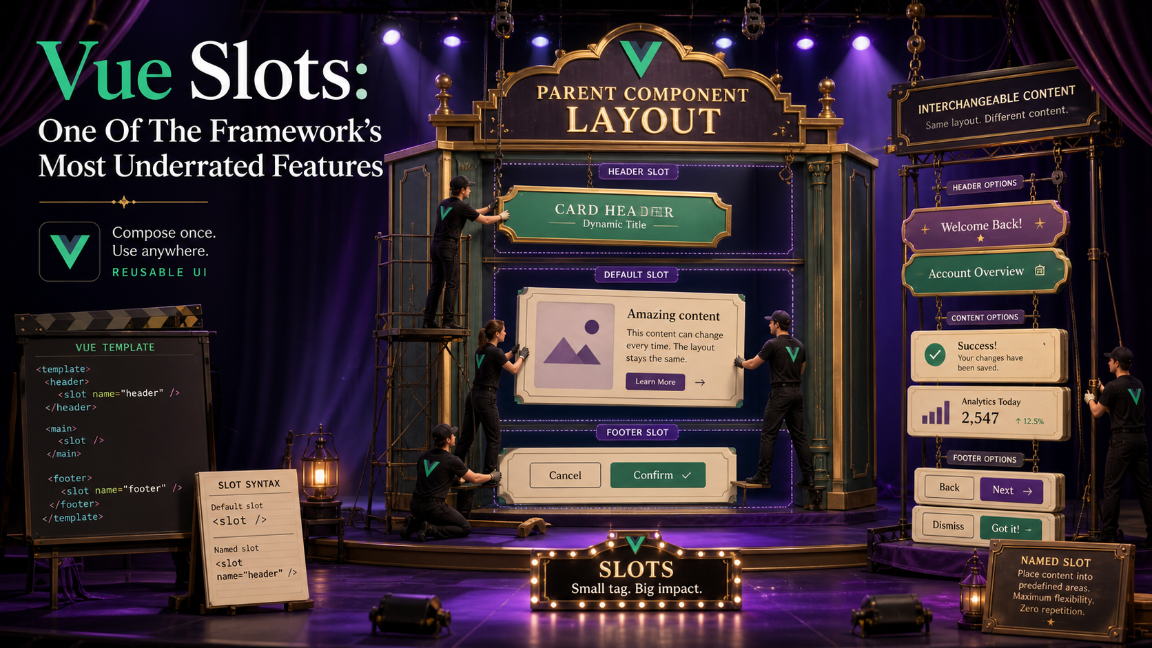
Named Slots For Multi-Region Layouts
When the component has more than one drop point — header, body, footer — give each one a name.
<!-- Card.vue -->
<template>
  <section class="card">
    <header v-if="$slots.header"><slot name="header" /></header>
    <slot />
    <footer v-if="$slots.footer"><slot name="footer" /></footer>
  </section>
</template>

<!-- usage -->
<Card>
  <template #header><h3>Title</h3></template>
  <p>Body text in the default slot.</p>
  <template #footer><Button>Save</Button></template>
</Card>
The #header shorthand is v-slot:header. Both work. The v-if="$slots.header" check is the small idiom that matters: it lets you skip the wrapper element entirely if the parent didn't provide that slot, so you don't end up with empty <header></header> tags.
$slots is reactive — if the slot becomes available later, the conditional re-evaluates and the wrapper appears.
Scoped Slots: The Underrated Half
Default and named slots let the parent send content down. Scoped slots let the child send data up — and then the parent decides how to render it.
<!-- DataList.vue -->
<script setup lang="ts" generic="T">
defineProps<{ items: T[] }>()
</script>

<template>
  <ul>
    <li v-for="(item, index) in items" :key="index">
      <slot :item="item" :index="index" />
    </li>
  </ul>
</template>
The child controls the list, the wrapping element, the keying, and the iteration. The parent controls what each row looks like:
<DataList :items="users">
  <template #default="{ item, index }">
    <span>#{{ index + 1 }} — {{ item.email }}</span>
  </template>
</DataList>
{ item, index } is just a destructure of the slot props. You can rename, ignore fields, or use the whole object. This is the pattern Headless UI Vue, Reka UI, and most modern Vue libraries use to keep their components renderless and reusable.
Scoped slots also collapse the "how do I customize this list item?" problem. You don't add an itemTemplate prop. You don't pass a render function. You just give the consumer a slot and pass the data they'd need to do their own rendering.

Typing Scoped Slots With defineSlots
Vue 3.3 added defineSlots, which lets you describe the contract of every slot the component accepts:
<script setup lang="ts" generic="T">
defineProps<{ items: T[] }>()

defineSlots<{
  default(props: { item: T; index: number }): any
  empty?(): any
}>()
</script>
The ? makes a slot optional. The generic T flows from the prop type into the slot payload, so the consumer's destructure ({ item, index }) gets the right type. The return type is any because Vue's slot return type isn't very expressive — but you do get autocomplete and type checks on the payload, which is the part that matters.
If you skip defineSlots, slots still work; you just lose the typed payload. For internal components I usually skip it. For library-like components that other people consume, I always add it.
Where Slots Beat Configuration Props
A short, opinionated list:
- Headers, footers, action areas. If the variation is "what goes there", it's a slot. Not
headerTitle: string, notheaderActions: { label: string; onClick: () => void }[]. A slot. - Empty states.
<slot name="empty" />with sensible fallback text. The parent overrides when they want a custom illustration or call to action. - Trigger elements. A dropdown, a tooltip, a popover — the trigger is naturally a slot. The component manages the open state and positioning, the parent decides whether the trigger is a button, an icon, or an avatar.
- Tables and lists with custom rows. Scoped slot for the row, with the row's data as the payload. This is the pattern that turns a "table component with 12 props" into "a table component with one slot."
Where slots are the wrong answer: when you genuinely have a fixed shape with values, props are better. A Badge with variant="success" | "warning" doesn't want a slot per state — it wants a string prop and internal logic.
A Real Pattern: Trigger + Content
A small, complete example that combines named and scoped slots — the kind of component you'd build for a design system:
<!-- Disclosure.vue -->
<script setup lang="ts">
import { ref } from 'vue'
const open = ref(false)
function toggle() { open.value = !open.value }
</script>

<template>
  <div class="disclosure">
    <slot name="trigger" :open="open" :toggle="toggle" />
    <div v-if="open" class="disclosure-content">
      <slot />
    </div>
  </div>
</template><Disclosure>
<template #trigger="{ open, toggle }">
<button @click="toggle" :aria-expanded="open">
{{ open ? 'Hide' : 'Show' }} details
</button>
</template>
<p>The hidden content goes here.</p>
</Disclosure>The component owns the open state. The parent owns the trigger's appearance and the content. Neither component has any knowledge of the other's styling. Replace the trigger button with an icon, an avatar, a custom rendered cell — none of it touches Disclosure.vue.
This is what "renderless component" means in practice: a component that handles the behavior and exposes a slot for the appearance.
A One-Sentence Mental Model
Props are for the values your component depends on; slots are for the shape it depends on. The moment you find yourself adding a prop that describes "what should render here" — a label, an icon name, a render function — it's almost always a slot in disguise. Switch, and the component usually halves in size and doubles in reusability.


